I don’t typically critique decks for fundraises we didn’t cover on TechCrunch, but for Supliful, I had to make an exception because it’s a company that solves a spectacularly interesting problem.
Consumer packaged goods companies can churn out products all day long, but marketing is an expensive challenge. Creators produce content all day long but don’t always have an easy way of monetizing their traffic. Of course, creators have access to affiliate marketing and/or promoting goods on behalf of brands, but Supliful comes along with another option: the ability to use their brand to promote white-labeled supplements and health products.
Men’s Journal breaks down the simple genius of the business model, and TechRound has an interview with the founder that dissects the details of the company, its founder and its formation.
Supliful also claims it raised $1 million with a really interesting deck, which was the thing that got my little ears to perk up. Plus, it was remarkably frank with its numbers and slides, without any redactions. Let’s dive right in.
We’re looking for more unique pitch decks to tear down, so if you want to submit your own, here’s how you can do that.
Slides in this deck
This is one of the best decks I’ve ever seen, despite being butt-ugly and riddled with mistakes.
On the first click-through of the deck, I couldn’t get past the fact that it is laden with typos and the design is god-awful. But after leafing through it more carefully, I reminded myself of my go-to golden rule: People are willing to suffer bad UX for good content, but they won’t suffer great design for bad content. This 22-slide deck ain’t perfect, but it’s a great example of how a company can use storytelling to make a point. It also uses a few slides I see very rarely in slide decks (financial levers and predicates, to mention a couple) that are used to great effect here.
- Cover slide
- Case study teaser slide
- Problem slide
- Solution slide
- Market size slide
- “Why now” slide
- “How it works” — product slide
- Financial levers slide
- Inside sales/market growth slide
- Case study slide
- Metrics slide
- Competition slide
- Predicates slide
- Team slide
- Investors slide
- Financial projections slide
- Use of funds slide
- Contact info slide
- Interstitial slide: Appendices
- Appendix: Suppliers
- Appendix: Adjacent market opportunities
- Appendix: Creator growth
Three things to love
This deck — design and typos notwithstanding — is extraordinary, and I’m unsurprised that Supliful raised money successfully. There’s a lot to love, but since there are a few opportunities to do so, I want to celebrate the more unusual slides that work really well.
Financial levers slide
High-quality founders understand what the financial drivers are in their company. I’m particularly passionate about this, and essentially, what it boils down to is “if we spend 5x more here, we get 15x more revenue over there,” or “if we spend 2x more on this aspect of product development, we cut time-to-market by a fifth.” Knowing how these things hang together is crucial. I explored that more a few years ago:
Supliful has a whole slide that shows that it has a deep understanding of what it needs to do to get where it wants to go:
[Slide 8] Financial levers. Image Credits: Supliful
This slide is deceptively simple, but it does a few things: It shows that in the next 18 months, the company wants to hit $4 million of gross merchandise value (GMV). That’s what the industry refers to as a BHAG — a big hairy audacious goal.
But it’s not just wishful thinking; Supliful explains that it knows how to get there — get average markup to a third. Ensure they get 5% commissions on storefronts. And roll out a subscription plan for creators. For people in the CPG space, those numbers will seem not just reasonable, but eminently achievable. The psychological effect of this slide is, “Well, I believe this company can pull this off.”
This slide clearly shows what drives the growth and evolution of Supliful, and that’s a lesson startup founders should note. If you can’t elucidate how you’re going to hit your goals, is that because you don’t fully understand or because there’s some complexity you haven’t cracked yet?
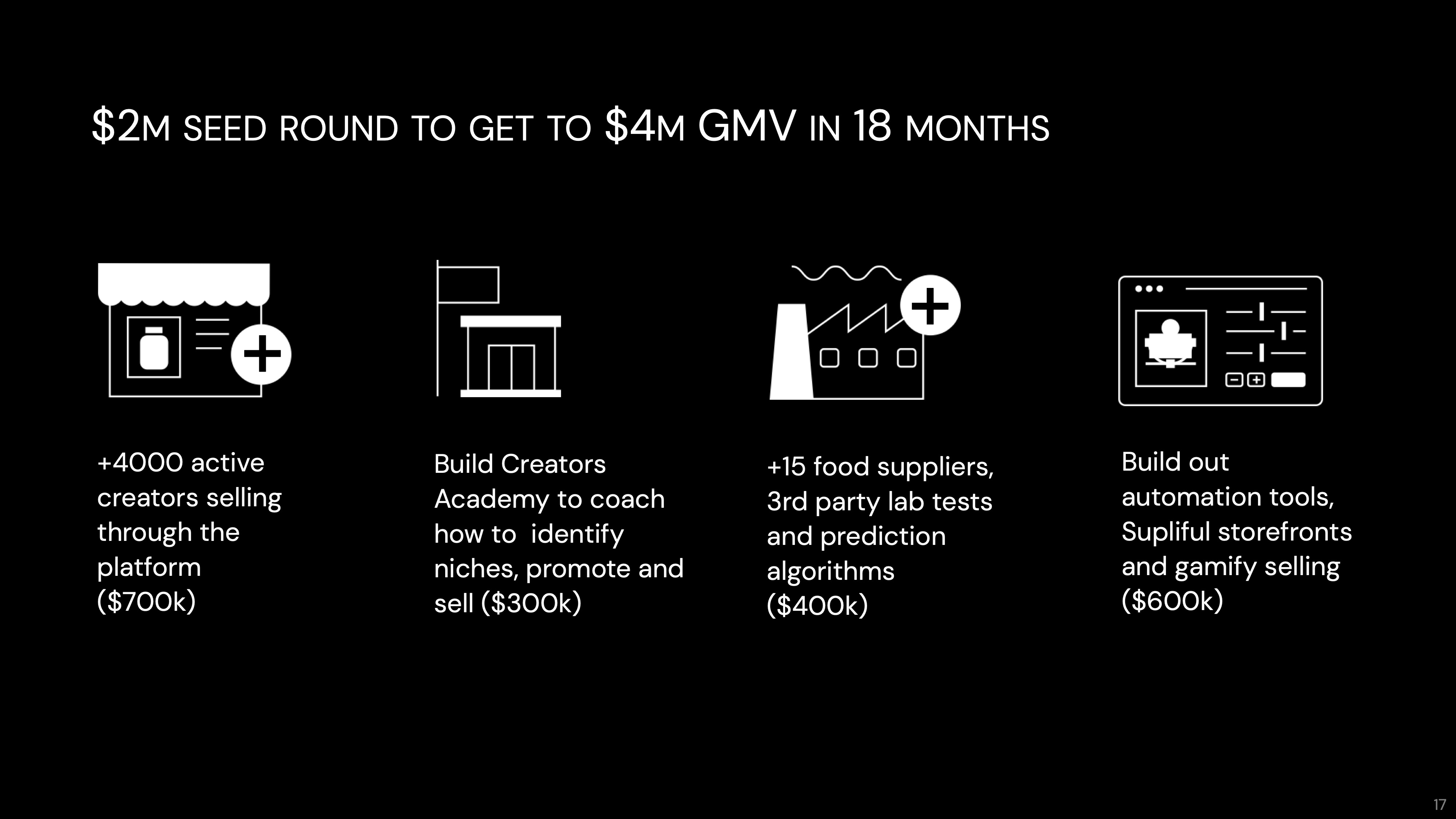
Super clear ask slide

[Slide 17] This is how you do an “ask” slide, folks. Image Credits: Supliful
Kinda similar to the above, but instead of talking about the specific goal, which is related to understanding the financials within the business, this slide discusses how much the company is raising and what it can accomplish when it does. It does two things beautifully — it breaks down how much Supliful is raising and shows what the money will be spent on. These are classic SMART goals: The company is promising 4,000 active creators, an education program, 15 suppliers and testing capabilities, and automation tools to make selling more efficient for creators, all for $2 million. It’s clear, and it’s easy to measure whether the company is on track.
For startup founders, the takeaway here is that clarity sells really well. There’s no doubt what the company is promising. My favorite is that the goals are distinctly defined. This isn’t “we will get some more creators,” it is “we will get 4,000.” This isn’t “we will engage with some food suppliers,” it is “we will find 15, and we’ll come up with a testing lab to ensure that what we’re selling is actually living up to its promises.
ChefsKiss.gif.
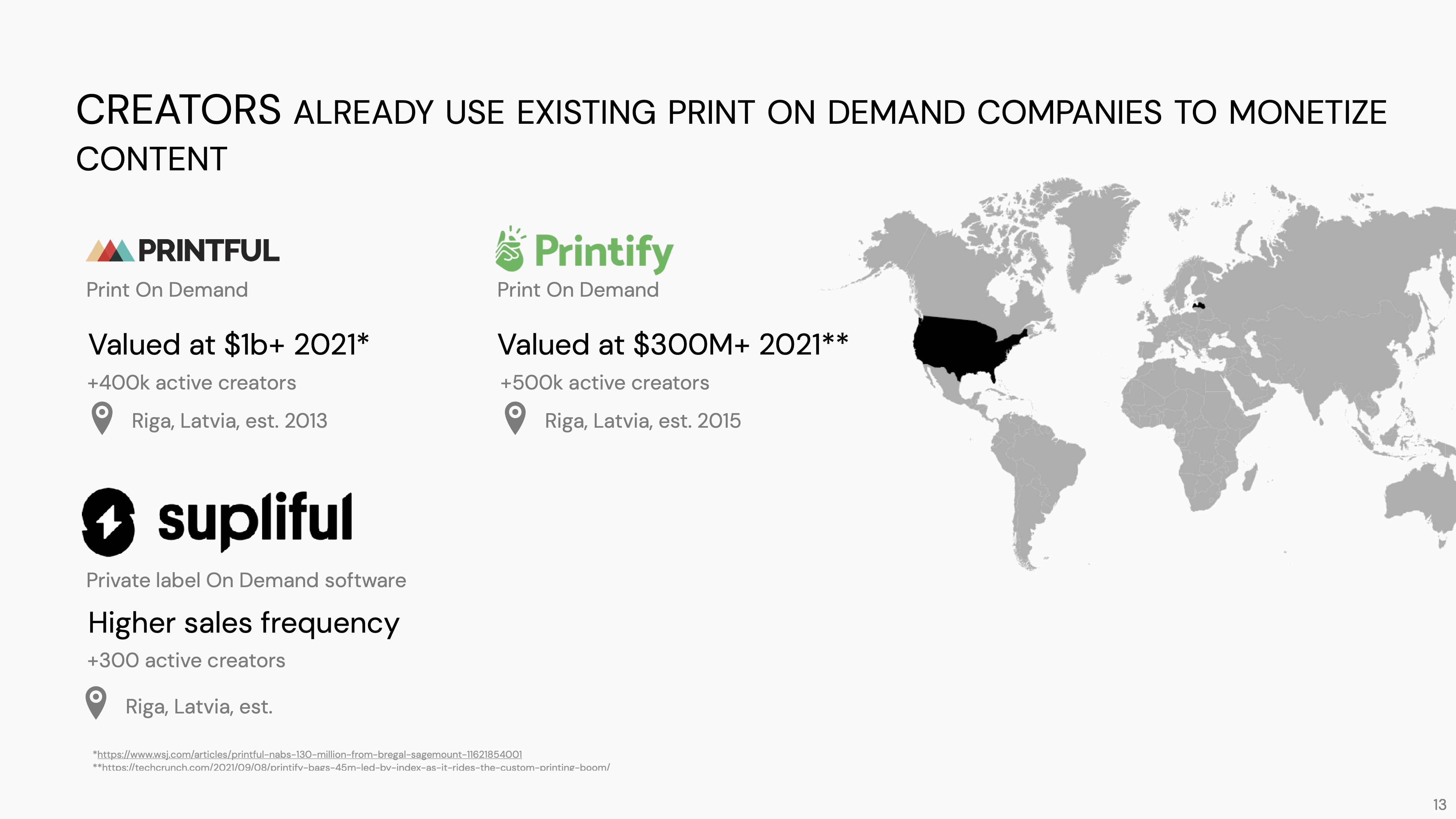
Predicates! Yaaaaas!

[Slide 13] Let’s talk predicates. Image Credits: Supliful
As a startup, you’re occasionally caught between a rock and a hard place; yes, you want to upend a market and change something significant, but when you do, how do you know that the customers want what you’re flogging? A great way of telling this part of the story is by using predicates — relatable examples in adjacent markets — that show that what you are doing might be possible in your market.
Supliful picked print-on-demand services. Creators, and especially cartoonists and visual artists, have long sold their designs on T-shirts, mugs, posters, etc. The print-on-demand market for these audiences is well developed, and you can point to a string of successful companies that use this model to help creators make money. It stands to reason that print-on-demand works for cartoonists, but what about wellness and fitness creators? Tah-daaaaah, that’s where Supliful comes in. I love this as a storytelling technique because you can say, “Hey, it worked over there, why wouldn’t it work for us?”
If you can find a comparable market with solid players that you can point to as a related market for what you’re doing, it can help make the story seem less scary.
In the rest of this teardown, we’ll take a look at three things Supliful could have improved or done differently, along with its full pitch deck!
Pitch Deck Teardown: Supliful’s $1M seed deck by Haje Jan Kamps originally published on TechCrunch


