It’s a fact that we all enjoy a good story, right? Human beings consume storytelling like nothing else. From daily news articles, to movies, music and books, we are voracious consumers of stories. Through them, we make sense of ourselves and our place in the world. We articulate our experiences, share them and connect with others through them. So what if those stories weren’t easy to access?
What if there were blockers that stood between you and the news, and storytelling, which help you make sense of the world?
That’s the reality for 300 million blind and low vision readers, for whom it can be challenging to access even basic news headlines online, due to the inaccessibility of website designs.
All websites should adhere to accessibility standards, but the vast majority (97% of homepages) do not. Even when accessibility guidelines are followed, there’s a big difference between creating a website that’s accessible for assistive technologies, and enjoyable human storytelling for blind and low vision readers.
The question is: How do we create online content that is genuinely engaging for everyone, whether you rely on your sight, or not?
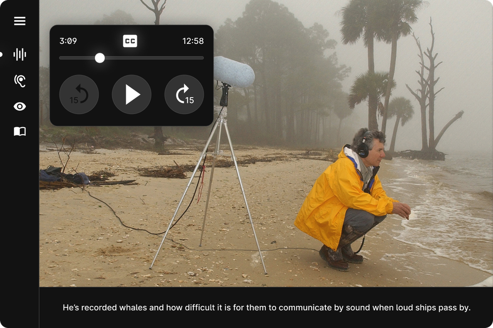
That’s the question we set out to answer with Auditorial — an experiment in storytelling that adapts to suit the reader, co-created by the Royal National Institute of Blind People (RNIB), The Guardian and Google.
It’s a piece of storytelling that is completely customisable, to offer those with visual disabilities an experience that is as comfortable, rich and creative as any other reader.
So if you’re blind and have sensitive hearing, for example, you can listen to the story but remove background noise to enable you to focus on the narrator. If you have photophobia, a light sensitivity, you can flip the story into dark mode, and all the animations take on a darker form. If you have a motion sensitivity, you can flip a switch that turns all moving images into keyframes. If you have faded colour vision you can enhance all the imagery. And so on and so forth.

This project is intended to pose a question about how much more accessible the world’s information could be, if you could simply tailor every website to suit your personal sensory needs and preferences. Through it, we hope to provoke a discussion about how the web at large might become a more inclusive place for people with disabilities, simply by offering different modes of interaction rather than taking a one-size-fits-all approach.
We captured key learnings from our collaborations with the blind and low vision community in the Auditorial Accessibility Notebook, to help other publishers of all shapes and sizes understand the simple tips and tricks that can open up online storytelling to millions of blind and low vision users.
By sharing these learnings, our hope is that more people than ever will be able to discover the stories that make us laugh, help us learn and open our minds.
And it starts with the adaptable story of The Silent Spring, written by the Guardian, for Auditorial.
Source : Improving online storytelling for blind and low vision readers


