I was born cross-eyed, and after two corrective surgeries, I thought I could see like everyone else. But I still had trouble driving, navigating stairs, and playing sports. In my late twenties, I learned that I mostly saw with one eye, and I couldn’t see in 3D. This is considered a hidden disability (similar to dyslexia or color blindness), and people with hidden disabilities could go years without knowing why some basic daily activities and interactions with technology are challenging.
There are millions of people with hidden disabilities and over 2.2 billion people who have a vision impairment around the world, but more than 70 percent of all websites are inaccessible to them. Often, there is a lack of awareness among developers and designers about both the challenges as well as how best to design and code for accessibility.
To bridge this gap, our Material Design team updated the accessibility guidelines on how to make images more accessible for websites and applications. The new guidelines explain how to write HTML code in the correct order for images to be read aloud by a screen reader, how to write alt text and captions for sighted and non-sighted people to understand images, and which types of images have to follow accessibility requirements. By following these guidelines, designers and developers can prevent common mistakes that may leave beautifully designed websites and apps difficult to use for people with visual impairments. We’ve started applying these rules to images in the Material Design guidelines, but there’s more to do to make the web more inclusive. Here are a few of the key lessons we learned:
Designing and coding should start with inclusivity in mind
Imagine how someone with a visual impairment experiences your website or app.When text is embedded in images, it may not be read aloud by screen reader software used by people with visual impairments. By implementing captions that describe how the images relate to the topic and alt text to explain the contents of the images, screen reader users will hear what the images are about.
The captions appear below the photo and explain the who, what, when, and where about the image. The alt text describes the colors, sizes, and location of the objects in the image.
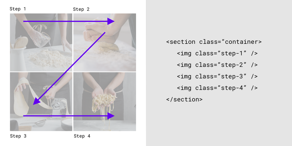
Designers put images in a specific order on a website, such as a four-step recipe with photos showing what to do for each step. However, if the HTML is not in the correct order, the screen reader will read out the alt text for each image in the wrong order, and the screen reader user may follow the recipe incorrectly. To prevent such (untasty) problems, we provided visual and text examples of the correct HTML code order.

The HTML reflects the visual hierarchy by reading the content from the top left (Step 1) to the top right (Step 2), bottom left (Step 3) to bottom right (Step 4).
Not all images are alike
Decorative images such as illustrations of fruit on a recipe website may not have to follow accessibility guidelines because they don’t contain critical information. However, informative images such as the foods in a recipe, should follow the guidelines because they convey information that is relevant to the adjacent text. The updated accessibility guidelines contain information about color contrast, text size, captions, and alt text. Images such as logos, icons, images within a button, and images that are links, benefit from alt text that describes their function and not what they look like.
Inclusivity helps everyone
Making products accessible means that even people beyond your target users may benefit. Captions help sighted people understand images. Alt text appears when images don’t load, helping sighted users understand what they are missing. People reading an online menu in poor lighting, such as during an electricity outage, might experience a temporary disability. They are more likely to be able to read the menu if it has good color contrast and large text.
Disabilities have too often stayed hidden and taboo. I believe we are entering a new age where disabilities can serve as a precursor to improving the world for others. The first time somebody at Google saw me looking at a document that was enlarged to 125 percent, I was absolutely mortified because I wasn’t keen on sharing my visual impairment. But then I realized that, in fact, being open and vocal could help make products more useful and accessible for everyone. I hope that these guidelines can help ensure that developers and designers implement accessibility so that those of us with visual impairments can fully access the content of their websites and apps.
Source : How accessible design helps everyone


