YA cover design is my jam. Since beginning my journey into this category of books close to 15 years ago—not even counting my own teen experience with it—covers have always made me pause and consider what it is they’re attempting to convey. The cover of a book is frequently the first marketing tool a reader sees. Depending on the style, readers know immediately what genre the book might be, what books might be similar in tone, and what they may experience while reading it.
Because YA book trends come and go, so do the design trends in those very covers.
As with many things in YA, we can thank Twilight for bringing much more attention (and money) to the category. That extends to cover design.
We had dark covers in the 2009–2011 era, which brought about nonsense commentary and critique in places like The Wall Street Journal.
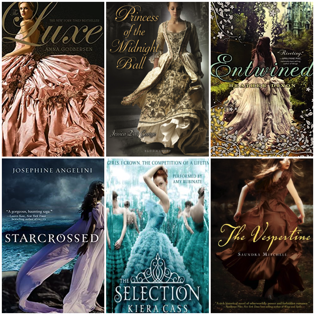
Then we had the trend of white girls in big and billowy dresses.
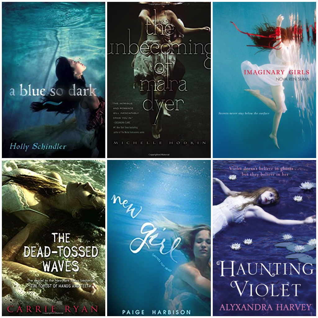
White girls were also drowning a lot, leading a psychologist to talk with Vice about why this particular trend was appealing to female readers.
And then, we had a shift. YA book covers moved away from these trends featuring stock images to covers that were illustrated. Two books embodied what turned out to be a seismic shift in YA book cover design in the U.S.: the first for its focus on nothing more than being font-driven and the other for minimalist illustration.
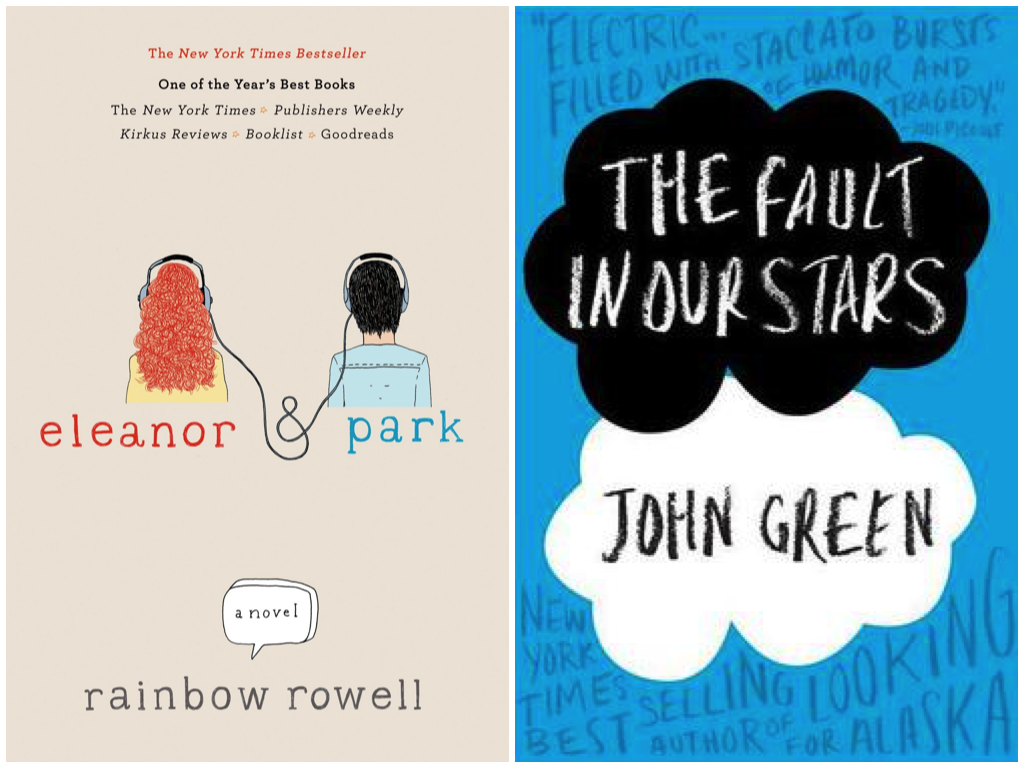
Both covers, of course, mimicked what adult book covers had been doing for a long time, and both made the books appealing to adult readers who would otherwise shy away from books labeled YA.
Over the next few years, cover trends followed in the footsteps of these two. It took a while because covers are often designed a year or so prior to the book release, meaning that by the time these two books hit shelves, there would naturally be a lag before they could launch a new era of design.
Enter 2014.
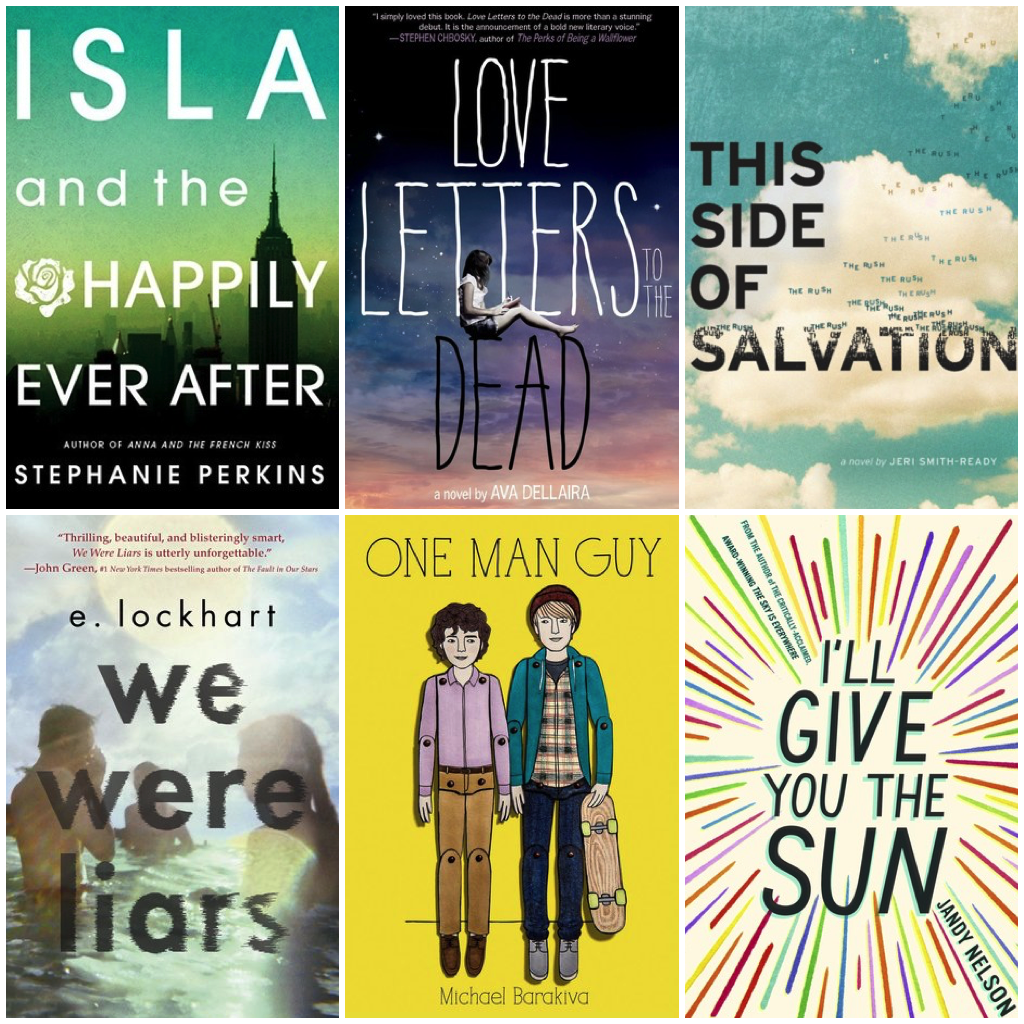
Fonts become central to YA cover design, and we begin to see the growth of illustrations, as opposed to stock images, to anchor the covers.
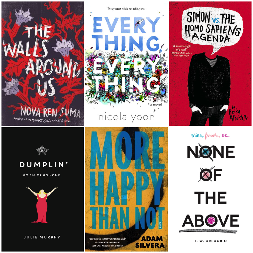
By 2015, the illustrated and font-driven YA book cover has started to make big waves. What’s perhaps most interesting—and important— at this particular moment in YA cover history is that we begin to see books by and about people of color receiving this same treatment. They’re shifted away as books for a specific audience (i.e. white supremacy in action) to being made marketable for all readers (i.e. still white supremacy but now, with much more vocal pushback from the YA reading world, representation is expected as opposed to being seen as a treat).
This trend continues today, with no shortage of illustrated YA covers being shared each time new covers are revealed, as well as no shortage of YA covers being font-driven. Some stand out for being unique or clever or perfect for the book they’re marketing, while others start to blend in with one another. It’s the same exact conundrum as the stock image cover trends experienced.
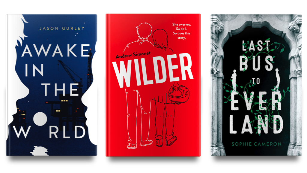
Something that has caught my eye, though, is a very specific font treatment on those covers. It’s not the same design that Claire at Book Cover Salt has been exploring in script-style choices (that blog is outstanding for cover nerds, by the way). And while you’ll see it in the covers below, you’ll also note it’s represented in a handful of the covers above.
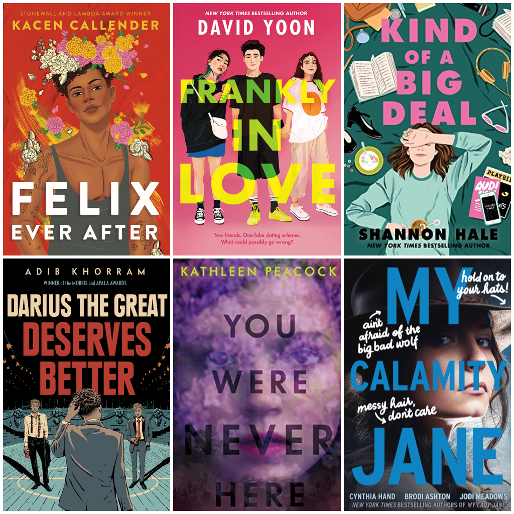
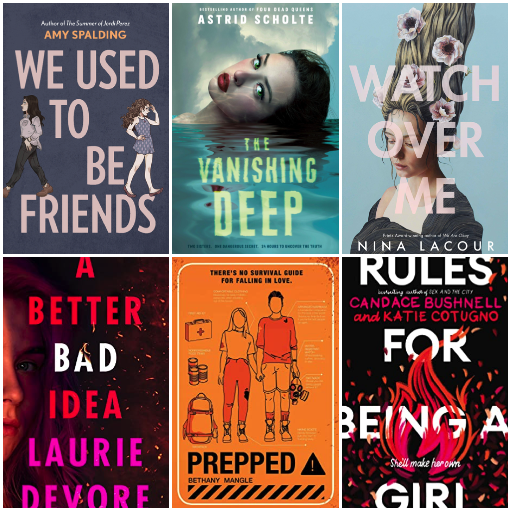
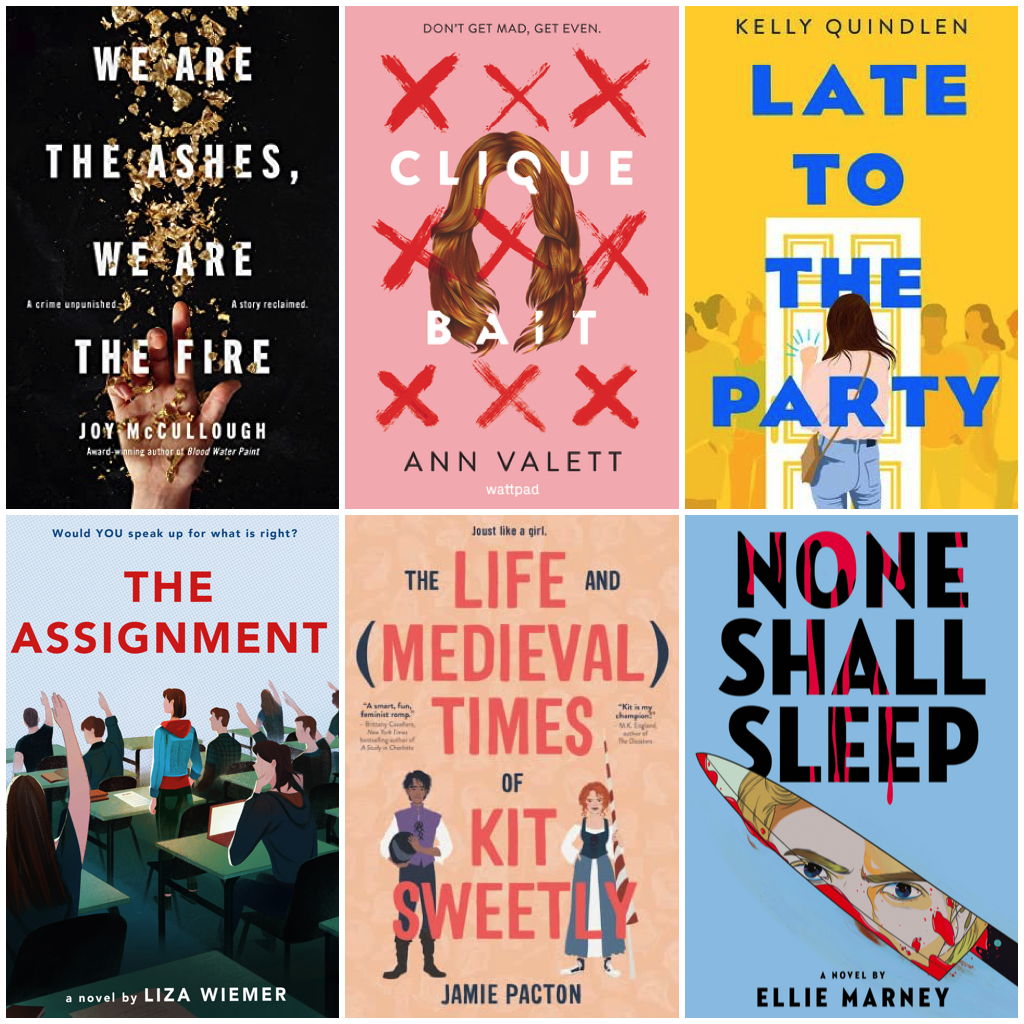

Though Futura features in a number of these font treatments, it’s not the only font represented. Rather, the fonts themselves do have in common that they’re sans serif, often centered on the cover or taking up the bulk of the cover’s real estate, aren’t tilted or turned, and perhaps most noticeably, there’s no drop shadow. Some treatments of the font are smaller or have wider kerning, but they certainly make a statement and, seen together, it’s impossible not to see the similarities.
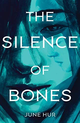
Aimee Fleck, designer, illustrator, and publisher—her work, including the YA book covers she’s designed, can be seen here—noted that indeed, the choices in font among YA book covers over the last few years has become similar, though not identical. Frankly in Love, for example, is indeed Futura font, but The Silence of Bones is New Age Gothic.
“I do have a theory,” she said, “it is a very similar treatment across the board! The loose tracking (space between), the very simple letters, and mostly sans serif.”
That theory is one that isn’t surprising, but it’s one that puts the shift in cover design from what it was in the early 2010s to what happened around 2015 into perfect context: the shift from focusing marketing from physical bookstores to digital shops. It was after Twilight and around the time of girls in big dresses when one of the major physical bookstore chains in the U.S., Borders, went out of business, thereby creating fewer places to browse.
As more people had better internet access and more commerce moved online in the mid-’10s, so did the need to adjust to how readers could make sense of design online.
“Increasingly over the past five years I’ve been in publishing, there has been more and more of a push from sales & marketing teams to make sure that a book cover doesn’t just look good when held in a person’s hands, but to look good and readable when viewed at thumbnail on sites like Amazon,” said Fleck.
She continued: “It’s become common (in my experience) for them [Amazon and Barnes and Noble] to request to see a cover not just big, but also very small, to make sure it’s still easy to understand and read when shrunk down. The more elaborate the lettering, the harder that can be. I’ve had to alter more designed fonts (script fonts and even serifs) for readability before.”
Common rules of design used to dictate that serif fonts were better for non-web use. Serif fonts, which have a small line attached to the tops and bottoms of each letter in a font family, create a visual guide for readers, as those serifs serve as a straight line. Eyes easily glide left to right. Those papers you had to write in Times New Roman in school are an excellent example of serif font. Serif fonts have more design elements to them, lending to better rendering in print, as well.
Sans serif fonts became much more common in the internet era. At smaller sizes, sans serif can be easier to read—and in an era where book covers need to stand out when made tiny, that font can pop in ways a more scripted or serif font can. Some designers believe it causes less eye strain as well.
Which isn’t to say that serif and sans serif fonts can’t be combined or aren’t combined, as often that itself lends to a potent visual impact.
For cover design in YA books, the combination of more illustrative art and the need to display well on small screens has made choosing sans serif fonts make sense. As the covers above showcase, the size and slight differentiation among font families makes them different enough from one another not to look repetitive and yet equally easy to read and understand.
“But the more detailed/elaborate the art, the more likely a designer is to choose a simple font; both again for readability but also just for visual balance,” said Fleck.
“I think between those two things, this kind of type treatment is definitely having its day in the sun,” she added, “but also, I suspect that it will continue to be common as long as online book retailers continue showing books at thumbnail. Overall, sales teams will want book covers to be readable at that size, and that’s going to mean simple type or big type or both.”
Chances are as we see YA book covers for the next few years, particularly in an era where in-store browsing isn’t as prevalent as virtual browsing and the impact of a book’s cover art is what makes it stand out on on visual platforms like Instagram, the font trends like those above will continue.
Likewise, as more readers become savvy to the art behind those covers, we’ll also see more designers being credited for the heavy lifting in creating a piece of work that plays a crucial role in getting a book into readers hands. Trends in cover design emerge not because of a lack of creativity. That’s abundant. Rather, these trends emerge because of the power a small number of mega retailers have upon the design and the desire to not only capture the tone and story within the book, but to also lead the book’s readers to their next favorite.
“Designers and often even illustrators tend to get the short end of the stick, publicly! It’s only recently that people on Twitter have been specifically requesting designers and artists be mentioned during book reveals, for example,” said Fleck. “The talent in this industry is mind-blowing and always pushes me to do better work; I think this specifically is a great example of how good book designers are that they’re managing to conform to ever-changing requirements/tastes without creating cookie-cutter books.”
Source : The Futura Is Now: Why YA Cover Design Looks The Way It Does


