“Hey, did you see the trailer for Scary Stories to Tell in the Dark?” my housemate asks.
“No, not yet.”
“I think it might be too scary for you.”
Well, she wasn’t wrong. I am a known weenie when it comes to horror. I get frustrated because I want to watch the amazing scary movies or read the books, but then I hate myself after when I can’t sleep. And I’ve got a long history with Scary Stories to Tell in the Dark. I was 11 when the third and final installment of the series came out, which made me the target age group, I think. I checked all three books out from the library multiple times. Weirdly, what got me about those books wasn’t the stories—even as a pre-teen destined to grow into a certified weenie, I didn’t find them particularly scary…and I remember one or two were even just based around truly awful puns. (I’m looking at you, “The Viper.”)
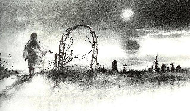
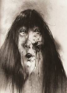
What haunted me and kept me from sleeping were actually the illustrations of the books. The originals were done by Stephen Gammell, and to my mostly untrained eye, they look like they might be watercolor or ink wash. Anything done with those media tends to look otherworldly by default, with the paint fading out to become a ghost on the page. And the stuff Gammell drew? Surreal, disturbing, nightmarish. Faces melt and contort, proportions are disturbing and misshapen, and some illustrations feel more like free association exercises. They scared the bejeezus out of me when I was a kid and figured in a hefty number of nightmares. I can still remember the ones that scared me the worst vividly, even though I haven’t looked at one of those books in over 25 years. They were pictures that made me refuse to touch the pages they were on, like I expected them to taint my hands—and yet I was fascinated.

I did actually watch the collection of TV spots, by the way. I wouldn’t go so far as to call them a trailer. And they were pretty creepy, and very Guillermo del Toro…but it didn’t scare me like I expected. Everything is too solid, on the screen, if that makes sense. Maybe the problem is the nightmares look too real. The Pale Lady has the same disturbing out of proportion body and face; when rendered solid she still looks creepy, but it’s a different kind of scare I don’t taste in the back of my throat any more.
 I might actually see the movie, then, because I don’t think it’s going to turn me into a tangled knot, hiding under my comforter while my cats look on in concern. It’ll probably creep me the heck out and startle me—del Toro is very good at that. But I think this is one place where the fear inspired in me by a still drawing can’t transfer fully into something as solid as film. Naming nightmares and giving them a definite shape means they have less power.
I looked at a few of the old pictures when I was trying to find an answer about how Gammell created them, by the way. I can say with confidence those books would still scare the hell out of me and leave me afraid to touch the pages.
Source : Pictures Worth a Thousand Nightmares


