Barnes & Noble has been around for many years (since 1873, according to the company website), and has evolved significantly throughout its history. The Very Model of a Modern Major Bookstore episode of Book Riot’s Annotated podcast delves into this history and explores how Barnes & Noble’s influence in the book world has ebbed and flowed. The episode also introduces one of the company’s current ventures: the Barnes & Noble concept stores.
One of the concept stores is in Columbia, MD, a mere 45-minute jaunt for me. It opened in fall 2018, so I figured it was high time for me to check it out and see the “concept” for myself. My hope was that books would be more in the spotlight, unlike the traditional stores heaving with toys, games, and other knick knacks. In an interview with store manager Jim Jurczak, my hope was affirmed.
“Our primary focus is books,” Jurczak said. “People still want books.”
Although there is still plenty of non-book merchandise available, the overall layout of the store makes books the main attraction. Building community and being conscious of the environment are also elements of the concept. There are many other little details within the prototypes that the company is hoping will give customers what they’re looking for in a bookstore.
Here’s a breakdown of the differences you’ll see between a traditional Barnes & Noble and one of its concept stores:
Store Size and Design
- The prototype in Columbia, MD is 17,000 square feet, whereas traditional stores can be more than double in size. According to Reuters, the average size of a Barnes & Noble is 26,000 square feet.
- Instead of carpet and tile, the flooring is porcelain that looks just like wood.
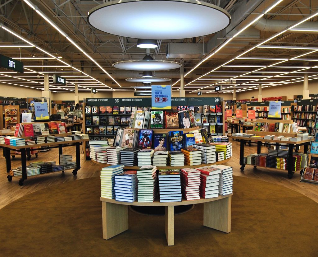
- The space feels brighter in general. There are extra large windows at the front of the store; the hanging lights have a different tint from the lights in traditional stores; and there is LED track lighting that runs continuously across the ceiling, as opposed to fluorescent lights spaced among the ceiling tiles.
Books, Media, and Gift Merchandise
- The store can be significantly smaller because of its approach to backlist titles. Jurczak explained that the breadth of books is just as strong as a traditional store, but the concept store carries fewer copies of each title (around 2-3).
- The section of books on local sites and topics is considerably more robust, and the store carries local publications (e.g. The Little Patuxent Review) on consignment.
- The concept store carries no CDs or DVDs, but has an expanded selection of vinyl records.
- The gift area has been expanded (particularly the candle section) and features permanent shelving instead of mobile fixtures scattered throughout the store.
“The space is being used more efficiently,” Jurczak explained.
Shelving and Displays
- There are two 360-degree “book theaters” to highlight new books. The theaters are permanently situated down the center of the store, one at the front and one mid-way through the space. The shelving units between the theaters are permanent as well. In non-prototype Barnes & Nobles, the octagon displays at the front of the store are on wheels, followed by mobile rectangular tables leading towards the back of the store.
- Each aisle of shelves is comprised of multiple shelving bays, but the use of transparent dividers between the bays creates the look of one long continuous shelf. Shelving in non-concept stores has wood dividers between the bays.

The 360-degree “book theater” at the front entrance of the Barnes & Noble concept store in Columbia.
Children’s Department
- To streamline the children’s section, the concept store has no stage area, and the play area is Lego-focused.
- Children’s toys and gifts are found in the kids’ section, not in a separate section of the store
Cafe
- The cafe is located at the front of the store. The Columbia Barnes & Noble’s cafe is immediately to the right upon walking through the entrance. Cafes in older stores are generally found much farther away from the front doors.
- Instead of the usual small tables for 2-4 people with the occasional outlet here and there, the concept store features community tables with USB ports and electrical outlets built into the furniture. Up to 26 people can be at the table at a time, charging their electronics.
Technology
- Rather than placing an information desk at the center of the store, booksellers carry mobile tablets allowing them to more easily help customers on the floor. They can do everything from search titles to process payment transactions.
- Touchscreen self-serve kiosks are peppered throughout the store, so customers can find books on their own as well.
Miscellaneous Observations
- The bathrooms are single-occupancy and also feature the porcelain “wood” floors. Because of Howard County regulations, the Columbia store is required to offer male-only and female-only bathrooms. The bathrooms are unisex in other prototype store locations.
- An emphasis is being placed on serving the community, especially the local literary groups, of which there are many. In the first six months after opening, the store has already hosted more than five local-author signings.
My overall impression of the prototype was positive. It still didn’t feel as intimate as some of my favorite indie bookstores, but the aesthetics were more welcoming and the emphasis on books was evident.
“We’re getting away from the idea of the superstore,” Jurczak told me, “All stores going forward will try to leave less of an imprint on the environment.”
This trend has proven to be true so far in the most recently opened Barnes & Noble stores. A new store opened at the end of April 2019 in Fairfax, Va. and at 8,300 square feet, it’s the smallest one yet.
The company plans to open 10 to 15 of these smaller stores in fiscal year 2019, so there might be one coming your way soon. If you check out one of the prototypes, please share your thoughts in the comments!


