I’m proud of being a writer, of being a woman. But I’m not sure how I feel about the category of “woman writer.” Am I also a writer of “women’s fiction” even when my protagonists are male? The woman who writes male protagonists also seems to invite the urge for gender camouflage. Would S.E. Hinton’s portrayals of tough men be as popular if she were published as Susan Eloise? Would J.K Rowling Harry be as beloved by both girl and boy readers if she published as Joanne? My most recent novel, The Evening Hero, is about two generations of Korean American male OB-GYNs. I never seriously considered a male pseudonym, but author colleagues who read drafts have often suggested it; at one point I thought of publishing under my gender-neutral Korean name, Myung.
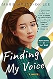 I am haunted by what a librarian once told me: over the course of her career, she’d found that girls will read books about girls or boys, while boys generally will not read books about girls. In fact, a librarian at the Morton Grove Library in Illinois once begged me to write a YA novel that had a boy on the cover because, she said, too many Korean American boys felt they had to sneak-check out my female-led YA novel, Finding My Voice, which they reportedly enjoyed, but also wanted a book they could carry around without being teased.
It has often felt like there is a tax on being a woman writer, especially if you are competing directly with male writers. My editor comps The Evening Hero to two of his male authors—comparisons I feel are apt but that I also take a little bit as a challenge. Carrying that anxiety of not wanting to be relegated to the “less than” category without a fair fight, I took a lot of it to what would be the first impression of the book: the cover design. I made sure to ask for a bold, text-forward font that is the hallmark of big male-authored novels for my proudly female name (when you add the Ok, which means “jade,” to Myung-Ok, the name becomes distinctly feminine).


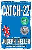
 I went further and forwarded on as suggestions the primary-colored Paul Bacon covers from the 50s, the “big book look” of instantly recognizable male-authored books like Portnoy’s Complaint, Slaughterhouse-Five, Catch-22. Because my novel spans countries and time periods with ginseng as a motif, I’d suggested an abstract cover with a priapic ginseng root as an element, maybe like Bacon’s cover of Peter Benchley‘s Jaws, but ginseng instead of a shark.
In the prototypes I received, I got zero roots, no boldly colored text. Instead, I got flowers (not sure what they signified in the book), as well as a figure of a Korean woman! Who was that? She is looking out a window and dressed in an upper class Joseon-era hanbok that doesn’t clearly correspond to any character in the novel but does correspond to a bunch of recent novels set in Korea by fellow women writers. (At least her head was intact.). It was my agent, Kim Witherspoon, who preserved the ginseng motif by coming up with the idea of an abstract root design, which the designer then paired with traditional Korean colors plus text-forward renditions of my name. When I saw it, it was like seeing my son after birth: that’s it. I’m sure there were abject sighs of relief behind the walls of Simon & Schuster.

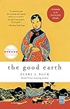
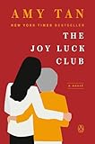 I had another anxiety, however, over the stickiness of the tropes of “ethnic writing.” As if there is a white America and Europe and the rest of us are just orbiting it. When I was growing up, the only book I could find with an Asian person on the cover was Farewell to Manzanar, written by a white man; most people thought The Good Earth was Asian American literature. Then along came Amy Tan‘s The Joy Luck Club, the success of which ironically made it a stand-in for all Asian American literature. In workshops, people either told me that I write like Amy Tan. Or that I don’t. There was always commentary on the amount of rice (or not) in my work, compared to hers, and where was the scene where the white boyfriend puts too much soy sauce on his rice and the aunties are horrified? It was then that three of my friends and I started the Asian American Writers’ Workshop, as a way to nurture ourselves almost in secret until we could dig ourselves out of the hole the culture dug for us.
Before the cover creation process had even begun for The Evening Hero, I requested (reasonably or not, I am not sure) a Korean book designer. Working on a novel for 18 years, I had clear ideas of what I wanted and needed, and I explained to my team that back when the New York Times had op-eds accompanied by illustrations, my editor, also Asian American, always commissioned a Korean or Korean diasporic artist. The illustrations became something that not only synergistically expressed the mood of the piece, but they deepened its themes.
For instance, an article about our family’s Americanization via the repeated Thanksgiving ritual had an amazing illustration of Korean songpyun rice cakes slowly turning into a basted turkey. Even for op-eds like the one about my son getting acclimated to New York, which had nothing to do with being Korean, they still hired a Korean artist and later, even had a gallery-type show and invited the authors to stand with their art. They picked that “My Son and the City” piece, the one that wasn’t overtly Korean, and yet, as I stood proudly next to the blow up of “my” illustration, there was something about it that felt very me, which is to say, the Korean American parent of my son.
I carried that approach to my book cover, and am grateful Simon & Schuster listened and took that extra step. Every time I look at my book cover now, I feel a kind of new-parent pride and glee. The other designs with the flowers and lady looking out the window were perfectly nice, even beautiful, but weren’t quite right. They kept expressing something of “other,” including past books by other Asian American women writers, but not me.
It’s not that I wanted to be treated as white male writer—this implies that being a woman writer, an Asian American writer, is somehow automatically less. It’s more that I wanted the full package of the book—the story, the text, the aesthetic elements like the cover—to reflect that I’m a woman and my main characters are men, to pick myself out of the mold, make my way without falling into the pigeonholes and the Joy Luck Club booby traps, to get to the place where the book reflects all of this, and all of me.
The post From Cover to Cover: On the Pigeonholes of Publishing appeared first on The Millions.
Source : From Cover to Cover: On the Pigeonholes of Publishing


