I’m obsessed with book covers. I always have been and always will be. Keeping an eye on book cover trends continues to be a role I do not take lightly, as I use some of the insights I glean to contextualize the annual
Parasol Against the Axe by Helen Oyeyemi, cover design by Grace Han
In a world of cover design that is afraid to truly stand out, this cover goes in the full opposite direction. Can you spot the parasol here, or is it like one of those 3D eye puzzles you did as a kid? The energy level here is off the charts — and that’s a good thing. This book is supposed to be a little odd itself, so the cover seems like the perfect fit for it.

Plastic by Scott Guild, cover design and art by Tyler ComrieBubble-style letters are having a moment (have you seen the monogram necklaces with them like these?). It should not be surprising to see it pop up in cover design, and I suspect this is not the first nor will it be the last. But what makes Plastic rise above is that it just fitst the title, the millennial pink coloring plays like a neutral here, and the actual image within the letters just feels, well, plastic. This cover is simple but extremely effective because of that simplicity. |

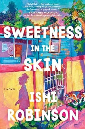
Sweetness in the Skin by Ishi Robinson, cover art by Alai GanuzaIf your first thought seeing this was, like mine, that it looked like an oil painting, then you’ll be pleased to know it is exactly that. Ganuza is an oil painter, and she did this cover for Robinson’s debut. This is a vibrant and energetic cover, but it doesn’t read as perfect or unflawed, either — something is slightly off, or else there’d be no story worth telling. |

Tell by Jonathan Buckley, cover design by Janet HansenRepeating titles down the front cover of a book is nothing new. It’s kind of dated, really, given that when font-driven covers became the new staple around 2015-16, that led to it becoming so common you didn’t even notice you were missing actual art on covers (some were great, of course, but many became mostly unmemorable). This takes the repeating title in a different way and to good effect. The three-dimensionality here makes the cover and title memorable, and you don’t actually miss having art on that cover. The pastel color palette works, too, though it would be interesting to see this in a brighter or starker palette. |

Witchcraft by Marion Gibson, design by Sarah BibelA good and effective cover does not need to reinvent the wheel. There’s actually nothing special going on here, but the black cat turned orange gives this one pop. (Of course, bonus points are awarded for the witchy font choices). |

Women! In! Peril! by Jessie Ren MarshallAs you may have noticed, one of the things that makes a book cover really work is that it leans into a style. Sometimes it’s a fresh take on a familiar style — see the animal covers here or the covers for genre titles. Other times, it’s a type of style we simply don’t see a whole lot of on covers — an oil painting, for example, or in the case of Marshall’s book, pop art. The colors are electric, the woman’s expression (even without any facial features) is clear, and the use of exclamation marks is fun (and reminds me a lot of the Jessie Ware disco album title from last year, That! Feels Good!). I don’t know much about the book and purposefully did not read the description because enough is going on here to suggest this short story collection is up my alley. |

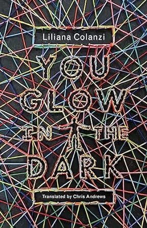
You Glow in the Dark by Liliana Colanzi, trans. by Chris Andrews, with cover art by Jamie KeenanThe earlier commentary on taking a familiar design and turning it on its head? That’s precisely what this string art cover for You Glow In The Dark does. It reminds me a lot of The Sun Is Also a Star (done by Dominique Falla) or The Color Master (also Falla) covers, but instead of going colorful string on white, it takes the colorful string and puts it on black, giving it that glowy effect. |

Your Utopia by Bora Chung, trans. Anton HurBora Chung has gotten excellent covers for her short story collections. For Your Utopia, we not only get a yellow cover — rare enough — but we get a robot that is clearly Not Well (those red lights pulsate even without any animation!). Something is awry here, and while I want to know what through the stories, I also don’t want to be in this guy’s way. |
If you’ve paid close attention, then you’ll know there are more than 24 covers here. I could not make a single cut. Moreover, there were other titles on this list that I did cut because I figured 25 was a reasonable count beyond 24, but 30 was not.
I hope some of these covers piqued your interest not only in their design but in their contents, too. I know my TBR unintentionally grew.
Find more posts like this via our subscription publication, The Deep Dive! Weekly staff-written articles are available free of charge, or you can sign up for a paid subscription to get additional content and access to community features.


