A book needs to be both enduring and pretty weird to get as many covers as A Wrinkle in Time has gotten since it was published in 1962. In fact, I hope a fellow Rioter who has never read the book writes a plot summary based only on looking at covers, à la our Pride and Prejudice explainer. I’m guessing from covers alone you’ll gather that there’s outer space, a centaur of some sort, and who knows what else. Normally, I like to give a bit of a blurb about a book’s plot, but I will let the covers speak for themselves this time.
I reread the book as I was writing this piece, and I was struck by how abstract it is. It wasn’t always easy for me to picture the action or the environment, partially because there’s so much of both, and I think that’s reflected in the truly remarkable diversity of the book’s covers. It was also remarkable to notice what a textbook ADHD queen Meg is. That observation helped me understand why I, as a kid who overly regulated my emotions allllll the way down, did not relate to her outbursts the way other readers did. What did spark my imagination as a kid, however, was the concept of the tesseract and understanding how moving through different spatial dimensions works.
What readers love about the book, like Meg’s character arc and the heady exploration of spacetime, are tricky to convey on a book cover. So let’s look at what these illustrators and designers attempted to show. I’ll rank all the English language covers I found, because I can’t resist a countdown.
23. The “Collector’s Edition”This comes in absolute last place for a couple of reasons. One, I dislike movie tie-in covers on principle, because they supplant what might have been really cool cover art and leave too little room for interpreting characters. Two, if it’s going to be a special edition, it had better be SPECIAL. Why is this one so boring? |
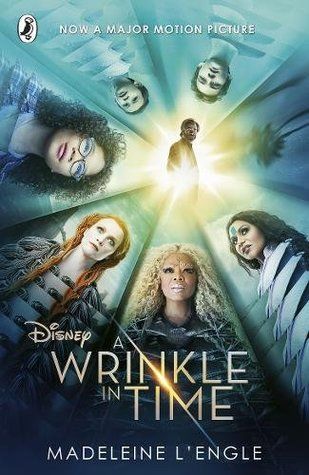
22. Disney Tie-In Number 2Let it be known that I am a fan of these actors! (We can agree he’s the best of the Chris canon, yes?) And I thought the movie was a perfectly fine adaptation. But let’s allow the movie to be its own thing, and the book can be a separate thing. I’m like a person who doesn’t like the food on my plate to touch when it comes to movies and books. |
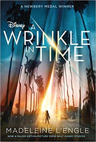
21. Disney Tie-in number 3This one is marginally better than the previous cover. At least you can see that something weird is happening with the universe, and making Meg backlit lets readers imagine her better. But isn’t there something weird and insulting about slapping that Disney name in front of the title? Too corporate. |
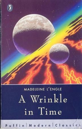
20. This Low Effort Puffin EditionI swear this is what was painted on the walls of my hometown bowling alley to make Friday night laser bowling extra groovy. |
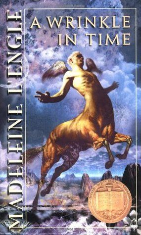
19. This Over-muscled Centaur CoverThis is like a knockoff version of the amazing 1990s Christian Riese Lassen folders I loved with, like, orcas in space and stuff. A too-swole centaur in the desert is nowhere near as cool as orcas in space. |
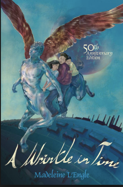
18. This Deeply Unappealing 50th Anniversary EditionIt’s hilarious to me that a book cover that’s ostensibly aiming to entice a child reader depicts the depressing landscape of Camazotz with a weirdly grotesque Egon Schiele-esque centaur. Yuck. |
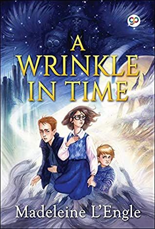
17. This illustrated coverSorry to the artist, but this looks like not-so-great fan art. I love that Meg’s hair is having a moment, but why does Calvin look like a middle-aged and beleaguered detective? |
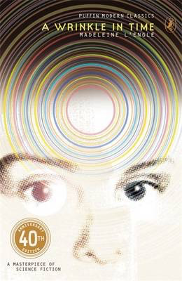
16. This 40th Anniversary EditionAnother low-effort cover from Puffin. With no other context I would think this is just a book about telepathy or telekinesis. Couldn’t they have at least included Meg’s glasses? |
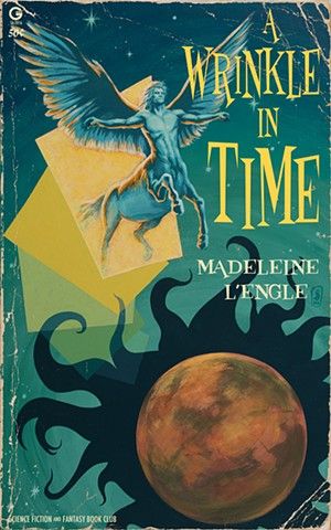
15. The Centaur Coming Through the Square EditionI appreciate that this cover is making things weird, but what about this lets kids know this book is for them?? |
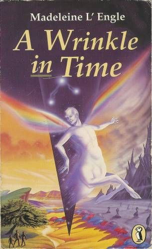
14. Rainbow Centaur Number OneFinally, a cover that shows that Mrs. Whatsit’s transformation is not into the standard centaur, but into a creature made of marble with wings made of rainbows! Points off for the unoriginal landscape that takes the kids from Pride Rock to Mordor. |
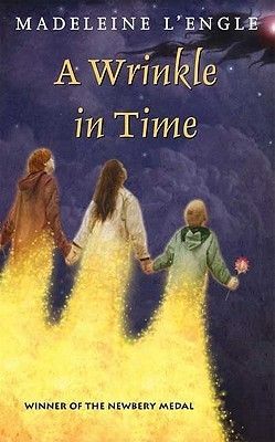
13. The “Baby, You’re a Firework” Cover“Make ’em go, ‘oh, oh oh!’ You’re gonna leave ’em all in awe, awe, awe!” |
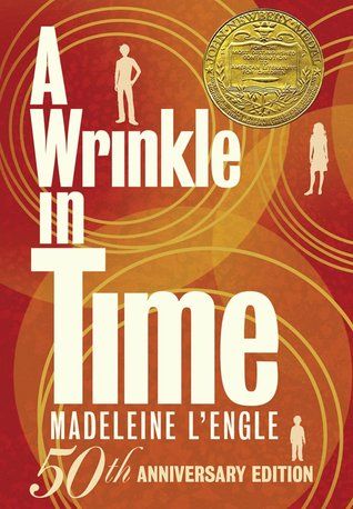
12. This 50th Anniversary EditionThis is a decent riff on the original cover. More to say on that later. |
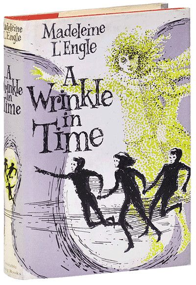
11. The Mime CoverThe vibe on this one is fun, but the characters look like jewel thieves in a snappy 1960s caper film. |
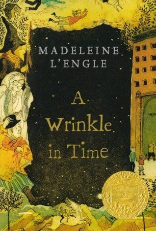
10. The Picture Frame Illustrated CoverI think the style of this cover is fun in a folkloric way, but it’s a little busy and hard to make out. |
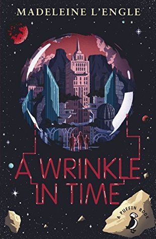
9. The Space Bubble CoverThe illustration on this cover has the most contemporary look of them all, and I think that’s worthwhile if we’re trying to get the kids of today interested in this book. |
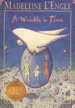
8. The Egg Children CoverI don’t think this cover is necessarily accurate to the story, but I like that it gives a feeling of both protection and adventure, which is certainly in keeping with the spirit of the book. |
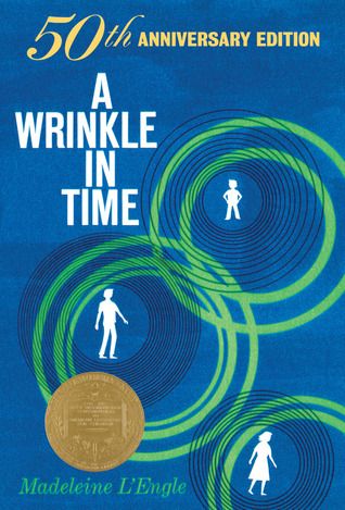
7. This 50th Anniversary EditionThis cover lets you know the book has been around a long time and has won the Newbery, but I still like the unadulterated original cover better. |
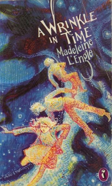
6. Puffin’s Best CoverExcellent artistic style, vague suggestion of space travel and danger, and extra points for Meg’s glasses! |
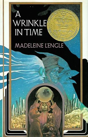
5. The Orb EditionI know that’s the Happy Medium. But I can’t be the only one who enjoyed the Pondering my Orb memes when those were going around. Bonus points for making the three Mrs. Ws look like weird and rad crones. |
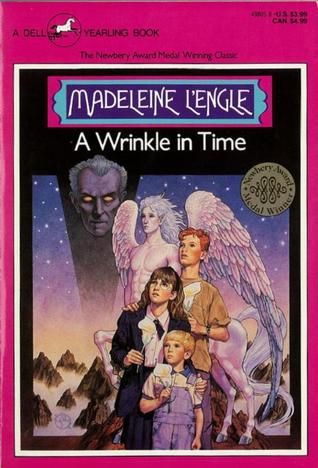
4. The Peter Cushing coverTell me that’s not Grand Moff Tarkin looming over everyone. I love how this reminds me of the cover of an Atari game. I also think this is a great look for Calvin, such a nonthreatening and formative book boyfriend to so many of us. |
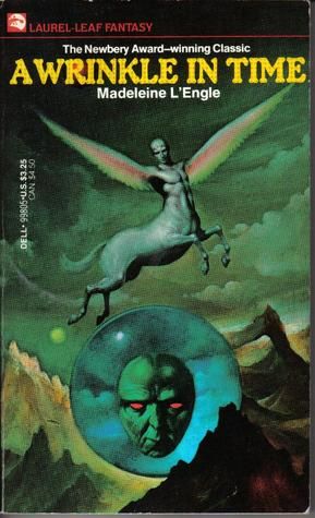
3. The Weirdest CoverPublisher: So did you finish that kid’s book cover I told you to illustrate? With the rainbows and the centaur and outer space? Artist: Sure did. Absolute nightmare fuel, just like you asked. Publisher: What? |
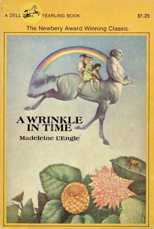
2. My Sentimental FavoriteIn Colson Whitehead’s classic New York Times essay about post-9/11 New York, he said, “You start building your private New York the first time you lay eyes on it.” And I believe the same is true for A Wrinkle in Time. Your private Wrinkle is the first one you lay eyes on. And this one is mine. It’s got the properly rainbow-winged centaur, and it’s not as scary as many of the other covers. Plus the bug on the leaf is a hat-tip to the kids like me who loved the explanation of traversing space on a wrinkle using an ant. |
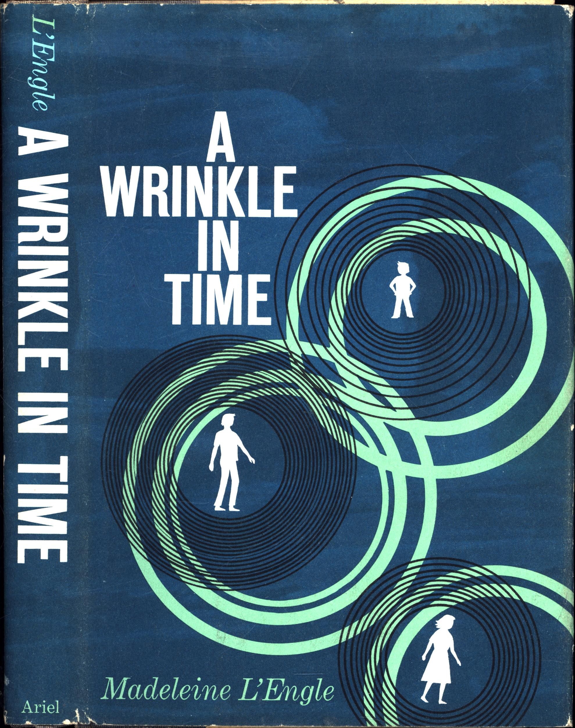
1. The Original FlavorI’m not prone to saying the original is always the best. But in this case, it is. It’s got great style. It leaves the details to the imagination, while letting us know something weird and dizzying is happening. Plus, just look at little Charles Wallace with his arms akimbo. Look at him! That little silhouette shows us his charm and fearlessness and that we absolutely need to protect this precious kid. (The orange anniversary cover changed his pose, which I rebuke.) They truly got this cover right on the first try. |
Do you want to read more about A Wrinkle in Time? We’ve got an essay about one reader’s experience with depression and this book, as well as a tale of revisiting it as an adult. And did I miss any covers? Do you agree with my rankings? If you don’t, I will give you the same advice Mrs. Whatsit gave little Meg: stay angry.
Source : 23 A WRINKLE IN TIME Covers, Ranked


